Friday, May 10, 2024

The Secret Life of Bridges

an animated map showing the cumulative growth of bridges in the U.S. since 1800
This amazing animated map visualization shows the cumulative growth of bridges in the U.S. since 1800. The map reveals the development of mass transport over the last two centuries and the enormous role that bridges play in the U.S. economy.

The animation is just one of a number of impressive mapped visualizations in Esri's Secret Life of Bridges. The Secret Life of Bridges is an Esri story-map which looks at the history of bridge construction and also explores the current condition of the country's contemporary bridges. There are over 618,000 bridges in the United States. Esri says that "roughly one out of every 13 bridges - about 46,000 in total - are considered to be in poor condition". 

Using interactive mapped visualizations of the grades awarded to bridges every four years by the American Society of Civil Engineers Esri has identified the areas of the country with the highest proportion of bridges in a poor condition. This helps to pinpoint the regions of the United States which are most in need of investment. The Secret Life of Bridges includes an interactive map which colors each county based on the percentage of its bridges in a poor condition. Click on a county on this map and you can view the country's total number of bridges, the average age of the bridges and the percentage deemed to be in a poor condition.

Thursday, May 09, 2024

Virtual Road Trips

screenshot showing the map,street view image and current status of the America - Road Trip Simulator
This summer why not go on that huge cross-country road-trip that you've always dreamed of undertaking? The great American Road Trip is a call to freedom. It is a chance to craft your own adventure while witnessing the vast beauty and the diversity of landscapes that America has to offer. Whether you crave the thrill of the Pacific Coast Highway or the charm of Route 66, a road-trip promises you the experience of a lifetime.

Alternatively you could avoid the unimaginable drudgery of endless hours of driving by staying at home and following the America - Road Trip Simulator instead. Simply open up a beer, lie back on your comfortable couch and take a virtual journey across America all from the comfort of your own home.

The 'America - Road Trip Simulator' styles itself as a 'serendipitous journey unfolding at your own pace'. Open it up and it will take you on a real-time simulated trip across the United States. The simulator uses a number of Windows 95 styled windows to provide you with information about the progress of your virtual road-trip. 

One of these windows provides you with a live animated map of the current location of your virtual vehicle. Other windows allow you to listen to a local radio station, view an image of your location from Mapillary, view Wikipedia articles of nearby points of interest, read local news stories, find nearby cafes and restaurants and view local classifieds from Craigslist. You can also open up a status window which provides you with a little data on your great American road-trip (currently I have been travelling for 46 minutes, have driven 36 miles and have visited only 1 state).

animated GIF of virtual cars moving around of a map of Virtual World
If the thought of traveling virtually across the whole of the United States feels a little too challenging then why not try a smaller virtual journey instead? If you haven't got the time (or inclination) to explore the whole country then why not take a little local drive around a small town on Virtual World

In this virtual world a number of virtual self-driving cars drive around navigating a virtual town, while trying not to collide with each other. You can use the drop-down menu to select a number of destinations for your vehicle. If you click on the steering wheel icon then you can take control of the car. This allows you to steer the car and to control the car's acceleration and brakes (on my laptop the arrow keys are the control keys).

Wednesday, May 08, 2024

The Future of Street View

animated GIF of a gaussian splatting 3d model of a street scene embedded into Google Maps

In 2007 Google began adding 360 degree panoramic images to Google Maps. It is no exaggeration to say that the introduction of Street View revolutionized online mapping. Now users could not only zoom into their neighborhoods in satellite view but they could also virtually explore their area in Street View.

It is almost impossible to predict the next major revolution in online mapping. For a couple of years now I've been thinking that photogrammetry was going to provide the next break-through in the online mapping experience. The amazing virtual 3D model of Tunet på Havrå, and those exhibited on Iconem Exploration hint at one way an accurate interactive 3D virtual map of Earth could be created using models created through photogrammetry.

Creating a high-fidelity global 3D map of Earth enhanced with interactive photogrammetry models of key locations is a huge complex task which requires access to a huge number of high-resolution images. Creating a photogrammetry model of a location on its own is still an intensive task. Once a 3D model has been created making it accessible on a 3D map, and user & device friendly is pushing the boundaries of what is currently technically achievable.

One thing that may accelerate this process is Gaussian Splatting. Gaussian splatting is a relatively new technique in computer graphics used for rendering 3D scenes. It is able to create 3D models from multiple images of a scene by creating a point cloud. Gaussian splatting excels at capturing details in 3D scenes. By adjusting the size and distribution of Gaussians, it is possible to focus detail on specific areas without needing complex geometric models. In short it has huge potential for creating high-quality 3D scenes.

Kieran Farr has created a Splats and Map demo which embeds a 3D Gaussian Splatting model of a street scene into an interactive Google Map. As you can see from the animated GIF above a 3D model has some huge advantages over Google Maps Street View. Instead of being confined to navigating from one 360 degree panoramic image the user is free to pan and move around a 3D scene at will. 

One of the most impressive aspects of Kieran's demo is the speed at which the map works on even fairly low level devices. It suggests that it is possible to create an interactive map which incorporates a few 3D models of important locations within a city. It isn't even too hard to imagine that in a few years time Google Maps will be one huge interactive 3D model of the Earth.

Monday, May 06, 2024

Hexagen World

screenshot of hexagen world showing lots of user generated hexagon images

Hexagen World is a game world generated by players using AI prompts. The game is similar to the popular r/Place project. However in Hexagen World instead of users adding one pixel to a collaborative image they can add AI generated hexagon tiles to a world map.

Register with Hexagen World and you can add your own hexagons to the map. Just click on a blank hexagon and enter an AI prompt to generate your map tile. Each hexagon you add to the map costs 100 points. 

Initially you can only add 3 hexagons to Hexagen World but you can earn more points each day based on your 'creative points'. Each time you add a hexagon your creation is awarded 'creative points'. You can then harvest these points every day. Earn enough points (100) and you can add another hexagon to the map.

animated GIF of a globe of the Earth made from plasticine

While exploring Hexagen World you might find a few hexagons based on real world locations. So far I've spotted the Statue of Liberty, lots of Chichen Itza inspired pyramids, the Colosseum (with two dinosaurs playing tennis), and the Acropolis.

If you want to see more world famous landmarks as interpreted by generative AI then you might also like Google Un-Dough. In this game, from Google Arts and Culture, your task is to identify famous cultural monuments around the world while turning unformed blobs of plasticine into colorful 3d models of the very same monuments.

Each game of Google Un-Dough starts with a 3D plasticine globe. To begin the game you just need to spin this globe and select the country whose monuments you wish to reveal. Once you have chosen a country you are presented with the image of a blob of colorful dough. You now have to reveal the cultural monument hidden within this plasticine blob by guessing the letters in its name.

In essence Google Un-Dough is a form of hangman which requires you to guess the names of some of the selected country's most well-known cultural monuments or buildings. Each time you guess a letter correctly the colorful blob of dough transforms a little more into the plasticine model of the monument. Each of these plasticine models was created by a generative AI.

Guess enough letters correctly and you can move onto the next monument, however if you guess 7 letters incorrectly you lose the game.

Saturday, May 04, 2024

540 Million Years of Planet Earth

an animated 3D globe showing how the world's climate has changed over the last 540 years

540 million years ago the Earth's climate was very different from how it is today. During the Cambrian period global temperatures were warmer than they are now. It is believed there were no polar icecaps and there was likely to have been high levels of precipitation and humidity over much of the planet. Of course our world hasn't always been so warm. The last Ice Age was during the Pleistocene Epoch, around 20,000 years ago. During this period around 30% of the Earth's surface was covered by ice.

You can explore the history of the world's climate for yourself at the Climate Archive. The Climate Archive is an amazing interactive map which allows you to view animated simulations of the Earth's climate for the last 500 million years. Select an era of Earth's history from the map's timeline and you can view animated layers showing precipitation, wind and temperature conditions around the globe during your selected period.

animated map showing the development of the Earth's continents over the last 540 million years

If you aren't interested in the climate then you can instead use Climate Archive to view the evolution of the Earth's continents over its long history. Just turn off all the animated climate layers (listed under 'Layers in the left-hand sidebar). You can then use the timeline below the map to view the development of the Earth's continents over the duration of the last 540 million years, from the Cambrian period right-up until the Cenozoic (Earth's current geological era).

But forget about the past. I;m sure you are more interested in discovering how the Earth's climate might change over the next 1 million years. Select Next Million Years from the map sidebar and you can view an animated globe showing the Earth's climate "over the next one million years following a brief but strong anthropogenic warming".

two animated globes comparing the Arrakis of now with the Arrakis of 50 million years ago

Having mapped out the Earth's climate for the past 540 million years Climate Archive decided to move on to also map out 50 million years of climate change on the fictional planet of Arrakis. Fans of Frank Herbert's Dune series of novels (or the recent movies) will be aware of the tough desert conditions on the planet Arrakis. But did you know that 50 million years ago Arrakis was covered in water?

Select the Dune link in the left-hand menu and you can view a 3D globe of the fictional dry desert planet of Arrakis, as it appears in the novels and the films. You can also view a 3D globe showing the climate on Arrakis 50 million years ago, when 91% of the planet was covered by oceans.

a globe of Radland

After mapping 540 million years of Earth's climate history and 50 million years of the climate on Arrakis Climate Archive also decided to map the climate on Randland (the world which features in The Wheel of Time novels by author Robert Jordan - dubbed 'Randland' by some readers).

The Randland 3D globe features an animated layer simulating the yearly climate on the planet. Having never read the novels myself I cannot testify to the accuracy of this climate model. If you don't think the climate is accurate then you can always use the layers menu to turn off all the climate layers, and just peruse the 3D globe of Randland on its own.

Friday, May 03, 2024

The 2024 World Press Freedom Rankings

global map showing countries colored based on their press freedom rankings

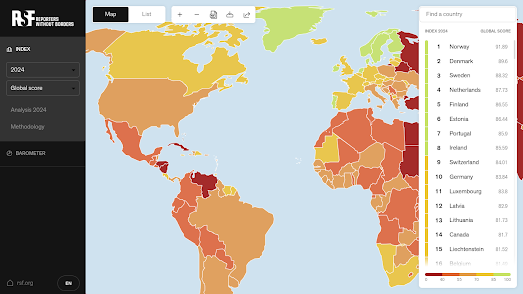
Reporters Without Borders (RSF) has released its annual World Press Freedom Index report. The 2024 report analyses and maps the levels of press freedom in countries around the world. The map ranks the level of press freedom in countries based on five different indicators. Norway, Denmark and Sweden respectively lead the 2024 rankings.

The United States has fallen to 55th overall. Once seen as a model of freedom of expression the United States continues to fall down the world rankings for press freedom. The RSF reports that in America, 'a growing interest in partisan media threatens objectivity, while public confidence in the media has fallen dangerously'. The RSF also notes that President Biden has personally been criticized for "failing to press US partners like Israel and Saudi Arabia on press freedom".

According to RSF the biggest threat to press freedom in the last year were politicians and political authorities. The organization uses five indicators to compile its country press freedom rankings. Of these five indicators the political indicator has fallen the most, reflecting a trend where many political authorities are in fact trying to control the media and suppress news and information instead of protecting and guaranteeing press freedoms.

The RSF points to a "clear lack of political will on the part of the international community to enforce the principles of protection of journalists" linking this directly to the more than 100 Palestinian reporters who have been killed by the Israel Defence Forces in the last year.

global map with countires colored to show the numbers of journalists imprisoned in 2023

According to the Committee to Protect Journalists' annual report, Attacks on the Press, nearly 75% of journalists killed around the world in 2023 died in Israel’s war on Gaza. You can explore the results of the CPJ's report for yourself on the Attacks on the Press 2023 interactive map. This story map takes you on a guided tour of the report's findings into the continuing attacks on the liberties and lives of journalists around the world last year.  

Israel and the Occupied Palestinian Territory saw by far the largest number of journalist killings last year. Of the 99 journalists killed around the world in 2023, 72 were Palestinians. China, Myanmar, Belarus, Russia, and Vietnam were responsible for jailing the most journalists, many of them without trial.

screenshot of Mapping Media Freedom's European map of alerts of threats to the media

Mapping Media Freedom is another organization which is dedicated to tracking attacks on the free press. Mapping Media Freedom maps threats to the media throughout the European Union and neighboring countries. It is a joint initiative from the Index on Censorship, the European Federation of Journalists and Reporters Without Borders. The map uses clustered markers to show the locations of crowd-sourced reports of threats, violations or limitations faced by journalists, newspapers or other media.

You can filter the reports shown on the map by location, date range or category. The categories include different types of censorship and limits to press freedom. They also include the option to filter by gender, type of journalist and the source of the threat to media freedom.  

Thursday, May 02, 2024

Whose Plaque is it Anyway?

illegible plaque on the side of a bridge over Bow Creek
For over 20 years I've wondered what the text on this plaque in East London actually says. This morning I finally decided to explore a few memorial interactive maps to see if I could discover why this bridge over Bow Creek has a plaque, and what the text on the plaque actually says. 

I thought it might also be a good opportunity to provide a little round-up of the growing number of memorial maps. So here are the cartographic references for my plaque search, and a couple of other memorial maps thrown in for good measure:

Read the Plaque has mapped over 20,000 plaques located around the world. As well as searching for plaques by location you can search Read the Plaque by tag or by the most recently submitted plaques. 

When you select a plaque on the map you can view its dedicated page, which includes a photo of the plaque and a transcription of the text on the plaque. A map also shows the plaque's exact location and the location of nearby plaques.

Anyone can submit a historical plaque to Read the Plaque by taking a photo of the plaque and marking its location on an interactive map.

screenshot of Read the Plaque's world map of plaques

The Historical Marker Database records the locations of permanent outdoor historical markers and commemorative plaques. The database allows you to explore the locations of markers and plaques around the world which are used to mark sites of historical importance. 

If you click on the 'near you' option and share your location with the Historical Marker Database you can view an interactive map of your nearest 100 markers. There is also an option to search for your nearby markers by topic (e.g. war, architecture, landmarks etc).

Open Benches is an interactive map of 28,592 memorial benches located around the world. These are benches which have been dedicated to the memories of local individuals, usually with a loving plaque.

London Remembers has an interactive map of over 7,000 plaques, monuments, statues, fountains which have been erected in the capital in order to commemorate a person or an event.

KilRoyTrip is an interactive map of World War II memorials in Normandy. It provides a fantastic guide to anyone visiting the region who is interested in the D-Day landings and the liberation of France. If you share your location with KilRoyTrip the map will show you the locations of your closest WWII memorials. Click on a marker and you will be taken to the selected memorial's dedicated place in the KilRoyTrip database. Each memorial entry in the database includes a description of the memorial, photographs of the memorial and links to other nearby memorials. 

close up of a plaque identical to the plaque on Bow Creek bridge
© Copyright Stephen Craven and licensed for reuse under this Creative Commons Licence .

After only a few minutes of searching I managed to find this memorial entry on Read the Plaque. This isn't the plaque on the bridge over Bow Creek but it is nearby and also attached to the Norther Outfall Sewer so I am almost 100% convinced that it features the very same text memorializing the construction of Bazalgette's magnificent Victorian sewage system.

Wednesday, May 01, 2024

The Global Inflation Tracker

an animated map showing inflation rates in countries around the world over the last three years

The Council on Foreign Relations new Global Inflation Tracker provides an intriguing guide to trends in prices across the world since the 1990s. On the map almost 200 countries around the world are colored to show their year-over-year rate of inflation (the darker the color the higher the rate of inflation).

If you animate through the data on the map it is striking how stable inflation rates in the Western economies were for a long twenty year period at the start of this century. During this period most western economies, including the US, achieved inflation rates consistently below 5%.

In 2020 the Covid pandemic started and in 2022 Russia invaded Ukraine. Both these factors have probably played a large part in ending this period of economic stability. Since 2021, inflation rates have risen globally, probably due to factors such as the supply chain disruptions caused by the pandemic and the escalating energy costs arising from Russia's invasion of Ukraine and the subsequent imposition of economic sanctions on Russia by Western nations.

The Global Inflation Tracker includes a drop-down menu which allows you to view the inflation rates for different sectors, eg for energy, food, clothing, housing etc. If you select to view the rate of inflation in energy you can view the huge rise in energy prices experienced since Russia's invasion of Ukraine. On a more optimistic note you can see how in recent quarters in most Western economies there has been a marked deflation in energy prices. This in turn seems to be contributing to an overall fall in inflation rates in many countries.

Tuesday, April 30, 2024

Live From Space

animated globe showing the position of the ISS next to a live stream of the Earth from the ISS

The 3D ISS Tracker shows the position of the International Space Station above the Earth in real-time. It also shows a stunning live HD view of Earth as seen and broadcast from the ISS. 

The position of the ISS is indicated by the little yellow dot slowly circling the Earth If you zoom out on the globe you can also view the current positions of the sun and moon. The cloud layer shown on the 3D model of the Earth is also shown in near real-time. 

The near real-time cloud layer is created from EUMETSAT data. The cloud layer is updated eight times a day, every three hours. If you want to use the cloud layer it is available from Live Cloud Maps. The 3D globe in the visualization uses Globe.gl, a 3D globe library which uses ThreeJS/WebGL for the 3D rendering.

If you want to spot the ISS for yourself then James Darpinian's See a Satellite Tonight can tell you when the International Space Station is flying over your house. It can also tell you where to look in the night sky so that you don't miss the ISS when it flies over your location.

Share your location with See a Satellite Tonight and you can view an interactive 3D Cesium Earth, showing your current location highlighted on the globe. The globe also shows the position of any satellites passing over your home in the next five days. The map menu (running down the left-hand side) tells you at what time tonight satellites can be viewed while flying over your location. It also allows you to view the locations of all the satellites passing your location over the next five nights.

And the magic doesn't stop there! See a Satellite Tonight also shows the tracks of all visble satellites overlaid on top of a Google Maps Street View panorama of your home. This means that you now know exactly when and where to look in the night sky if you want to see passing satellites with the naked eye.

Monday, April 29, 2024

Weather or Not

Weather or Not's temperature map of the US

Do you dream of the perfect vacation weather? Sunshine on the beach, crisp mountain air, or vibrant fall foliage?  Imagine a tool that helps you find the ideal destination for your desired climate, anywhere in the country and for any month of the year.  This is the promise of Weather or Not, a new interactive map that leverages average weather data to recommend the best time to travel to any location. 

Weather or Not promises to help you discover the best time of the year to travel to different parts of the US if you want to experience your ideal temperature conditions. Enter your ideal temperature range (eg 60-80 Fahrenheit) into Weather or Not and the map will color every US county based on the time of year when you are most likely to encounter your ideal weather conditions in that county.

If you are planning a vacation then you can use the map to find which counties will most likely fall within your perfect temperature range in the month that you wish to travel. Select a month from the drop-down menu and change the view option to 'Yes/No'. The map will then color each US county based on whether it is likely to fall within your ideal temperature range in the month that you wish to travel. 

animated map showing average daily temperatures across the US over the counrse of one year

We all have our own ideas about what the ideal weather conditions actually are. myPefectWeather is another interactive map which can help you find the locations in the United States which most closely match your own preferred temperatures, precipitation levels and /or amount of snowfall.

If you select the 'options' button on the myPerfectWeather map menu you can begin to discover the locations across America which most resemble your ideal climate zone. For example - if you select 'the average high temperature' filter then you can enter your desired range of maximum temperatures. The map will then adjust to visualize the places that most closely match your preferred temperature range. 

You can also filter the map by average daily precipitation, average daily snowfall and comfortable weather days. You can also view a detailed breakdown of the annual weather conditions in any city by using the map's search box.

US map colored to show the number of days in the year that each location is likely to experience temperatures between 40 & 80 degrees

The Goldilocks Zone Finder is an interactive map which can also help you find the location in the United States which has your perfect year-round temperatures. Just tell the map the hottest and coldest temperatures that you are happy to live with it and it will show you a map displaying the number of days per year which fall within your own personal Goldilocks temperature zone, for all locations across the United States.

The Goldilocks Zone Finder was created by Luke Champine who wanted to find a place to live which fell within his own personal temperature preferences. The map uses data from NOAA's 30 Year Climate Normals, which uses 30 years of weather measurements taken across the United States to calculate daily temperature averages. The NOAA Climate Normals also includes averages for precipitation and other climate variables but these are not included on the Goldilocks Zone Finder.